Capsule - This one graph, M1 Money Supply and Inflation in the United States
total votes: 1
I am crazy enough to believe there is a connection between the amount of money in circulation and the sharp increases in prices we have experienced in the US over the last year or so.
This one graph[1].
Money Supply
This[1] my friends is a chart showing the M1 money supply[2].
When you read the Investopedia article about M1, a couple of things stand out. First, M1 is the measure of the most liquid assets. Liquid basically meaning cash or something that can be easily converted to cash[3]. The second interesting point about M1 is that it is no longer used by the Fed to guide policy  . The explanation for why the Fed no longer uses M1 for guidance according to Investopedia is "The M1 is no longer used as a guide for monetary policy in the U.S. due to the lack of correlation between it and other economic variables." For which they cite a Ben Bernanke speech from 2006[4]. What they do use is M2[5]. M2 contains M1 and some other less liquid assets (but still pretty liquid). The M2 graph is still pretty similar to the M1 but not spiking as sharply after the "Covid Crash" in March 2020[6].
What is inflation? Inflation vs Price Inflation
You are probably asking yourself "Ok but why are you telling me this?" Great question! I am a member of cult (according to Paul Krugman[7]). This crazy "cult" I belong to thinks there is a connection between the amount of money in circulation and the price of goods! Like any good topic in economics you will find heated emotions, ad hominem arguments, name calling, etc. It makes you wonder if this "science" is really a science in the sense that physics is a science? It is actually an interesting question[8] but beyond the scope of this article.
In order to understand the inner workings of our cult you we first have to address the fact that my "Cult of Inflation" actually uses a different definition for the the word inflation. For the cult, inflation simply means an increase in the supply of money[9]. Our definition of inflation is clear and easily tracked. Just look at M1[1]! The cult uses a second term called price inflation.. This is a much more difficult value to determine and understand as prices depend on numerous factors and these factors constantly change and can effect prices in regional and localized ways. The measure that is often used by the mainstream economists and news outlets is the CPI[10]. One big problem with the CPI is that it has been redefined over and over and OVER throughout the years[11]. It is a significant source of confusion to keep redefining a variable while keeping the name the same. Any publication which includes historical CPI values requires you to understand which definition of CPI they are using or if they are actually using a bunch of different CPI definitions in the same chart!
The mainstream explanation for increased inflation
The mainstream economists and news sources all but ignore increases in the money supply. I googled "what is causing inflation" and these are the first news articles that came up in the first page of results[12], [13], [14]. According to the Forbes article[12] "Inflation is caused by the gradual increase in the prices of goods and services throughout the economy." That isn't a cause of inflation that is literally just the definition of inflation (or price inflation if you join our cult)! The next article is very illuminating as it completely avoids mentioning the federal reserve's actions and any discussion of the supply of money. "Generally, the story goes something like this: At the start of the pandemic, consumers began spending less because of lockdowns, and in turn, started saving more. Then, when Covid-19 restrictions eased, people started spending more again.[13]." The last article is all about the theory of the "pandemic savings boom" which they do at least admit is "driven in part by federal stimulus" [14].
What is normally cited is the personal savings rate[15]. Indeed there was a spike during the initial Covid-19 lockdowns which tails of relatively quickly. Another chart illustrating this is the personal savings[16]. I find this an easier chart to use as it gives you information as to the magnitude of personal savings. You see that it increased from about $1.8 trillion in Q1 2020 to $4.8 trillion in Q2 2020 in the US. This excess savings drops back down below Q1 2020 levels by the end of 2021.
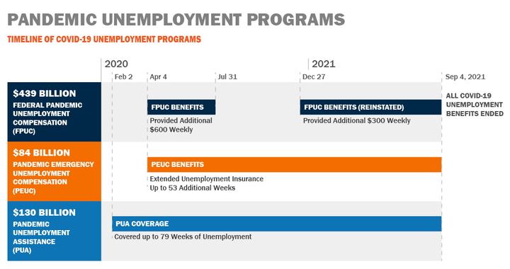
The usual explanation for this is people started saving money because of the uncertainty caused by the pandemic but as things returned to normal people began to spend the money they saved. I believe this is inaccurate. This explanation ignores the trillions of dollars which were directly paid to individuals which caused the increase in savings. It wasn't about a behavior change in all people it was about the direct intervention by the US government and Federal Reserve which resulted in a temporary increase in savings. This is only part of the effect of the government and Fed interventions. There was over $900 billion in direct stimulus to US individuals [17]. Additionally, there was a significant increase in unemployment benefits directly paid to individuals of $653 billion [18]. This already accounts for half of the increase in savings. Furthermore, this is new money added to the economy will directly show up as an increase in M1. If you have trouble seeing that connection, think that the government is always operating at a deficit. In order to fund entirely new spending such as this, they must do it through selling treasuries which the Federal Reserve buys with newly created money. Thus, the increase in M1.
What about the rest of the increase in M1? The change in M1 was more than a $16.5 trillion increase. Now you can see why I refer to "this one graph [1]." They want to convince you that the $3 trillion in increased savings is what caused the price increases and never mention the $16.5 trillion increase to the most liquid part of the money supply! The purpose of this article is not to attempt to account for each dollar espoused by the different theories to be the smoking gun. Rather, I am showing there to be an order of magnitude discrepancy in the amount of money injected into the economy (M1) and the increase in personal savings that I haven't already accounted for through direct government stimulus and increased unemployment. To ignore M1 and focus on increased personal savings is laughable. But this is what you all hear over and over from your mainstream information sources. They do love to point to the pandemic as the source of an increase in wealth disparity [19]. They do not want you to realize that it isn't the pandemic itself that caused the increase in disparity but rather the various central banks and governments responses to it.
created by wuliwong
Share this capsule link.

:max_bytes(150000):strip_icc()/money--money--money-3429418-a99756eabdfe4e8aab5417684056dea3.jpg)